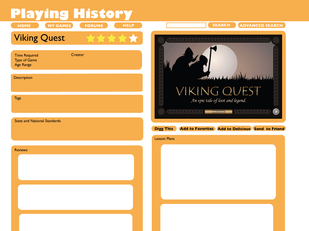
Here is a quick mock up of a individual games page for Playing History. (Click on the image to see it at its native resolution) Everything isn’t perfectly lined up but you get the picture.
Here is a quick mock up of a individual games page for Playing History. (Click on the image to see it at its native resolution) Everything isn’t perfectly lined up but you get the picture.
The color/image scheme is very seasonal! It is clean and simple though I might like the image moved to the left so that the two characters 'move into' the site.
LikeLike
Sweeet! Great site. Quite a handful, though. Do you have a plan whereby developers can show their products to teachers, that might be rather difficult to actually put together. A lot to accomplish in one website, but it really looks good.
LikeLike

Leave a comment