As an oft compelling blog notes, Comic Books are Interesting Except When They are Not Interesting, and there is no shortage of both interesting and uninteresting sites presenting the history of comics on the web. For my review I will be discussing two different approaches to presenting comics and their history. The first site, Beyond the Funnies: The History of Comics in English Canada and Quebec “explores the history of the graphic-narrative medium in Canada”. You can see a image of the home-page below.
 The site presents a engaging attempt to use the style of comics to present the history of comics. However it ends up looking a bit too busy for my taste. When you look at the header it is just too busy. What do you think the viewer is supposed to focus on? For me the three outlined pieces of text at the top of the header image are just too much. “About This Site” “Comics Gallery” and “Create Your Own Comic” just don’t fit into the style of the head image, I would like to see them either better integrated into the image or pulled out with the five text links at the top of the page.
On the side of the page, the site navigation through speech balloons works much better for me. Here we an see them repurposing the style of comics into the format of their page. I found myself immediately understanding both the reference and that these were links to navigate through the site and that makes for good design.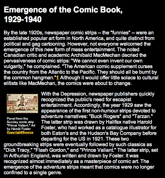
When you click the “Introduction” link from the header, the link I felt most clearly denoted where I should start moving through the site, (It is the big bright and pushed to the top left of the screen) I could clearly see the site take on another traditional form, the historical paper. You can see the title, the page is dominated by text, leaving very small images, and footnotes hyperlinked to the bibliography at the bottom of each page. While I understand that there is quite a bit of value in publishing books online, it would seem that if a project, like this one, is “born digital” it would make a lot of sense to lose the trappings of the academic paper and embrace links, and in the case of the history of comics bigger images.
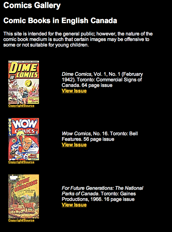 The site does offer a comics gallery, where viewers can engage with the books themselves more. But the page is de-emphasized, one of those small links that seems out of place at the top of the header. And even still when we get to 10 comics they offer us the images are still tiny. Completely overshadowed by their bibliographic information.
Instead of embracing the possibilities of the database structure of new media, by say offering visitors to search through comics the site models itself on a academic paper (understandably there is a rats nest of rights issues here but imagine a comic books site modeled off something like BYU’s Time Archive for comics) What do we gain from this being on the web as opposed to published in paper? As I see it not too much.
While the site is interesting, and believe me much more well organized and useful than a series of other amateur sites on the history of comics it is ultimately old media in a new skin, somewhat missing the point for the possibilities of the new medium. Nonetheless a solid attempt from 2002 and of-course we must thank them for not using Comic Sans in the main body.

Leave a comment